The fastest way to understand a data wrangling pipeline is to build the messy dataset yourself, plant the problems you are going to solve, and then solve them. That is what this assignment does. It synthesises two related ride-share tables with realistic shape, drops in the specific issues a real extract would carry, and then runs the standard pipeline over them: merge, understand, manipulate, scan, transform, summarise.
The interesting part turned out not to be the pipeline. It was watching the planted problems behave in ways the plan did not anticipate.
Three missing driver ratings were seeded into a fifty-row driver table. After the left join onto seventy-five rides, those three drivers accounted for nine missing ratings, because one of them, driver 8, had taken five separate trips. Three seeded nulls in one table became a 12% missing rate in the joined table. That is the ordinary arithmetic of a one-to-many join and it is easy to forget until you see it.
A single extreme driver rating of 1.5 was planted and then vanished. It never appears in the merged data, because the driver it was assigned to took no rides in the seventy-five sampled. The boxplot of driver ratings shows a clean distribution from 3.56 to 4.98 with no low outlier at all. The outlier was planted correctly and it simply did not survive the join.
The extreme fare and the extreme distance did survive, and they behaved as designed. A $150 fare and a fifty-kilometre trip both show up as isolated points in the boxplots, and both propagate into the derived columns: the fifty-kilometre trip drives the hundred-minute estimated duration, and it also produces the lowest fare-per-kilometre value in the dataset at $0.45, because the seeded distance was written over a row whose fare stayed where it was. The two planted values are not on the same row, so the correlation between distance and fare, which the generator was careful to build in, breaks at exactly those two points.
There is one more thing the data does not support, and it is worth saying because the assignment’s own narrative got it wrong. The prose written at the time claimed Premium vehicles command the highest median fares. They do not. Premium averages $24.90 per trip against Sedan’s $28.70 and SUV’s $29.80, because the vehicle type was assigned independently of trip distance in the generator. There is no price premium in this dataset because none was built into it.
In brief
- Two related tables generated: 50 drivers (id, name, vehicle type, rating, join date) and 75 rides (id, driver id, distance, fare, payment method, date)
- Fares generated as $5 base plus $2 per kilometre plus normal noise with SD 2, so distance and fare correlate by construction
- Three missing values seeded per table; after the left join the merged table showed 9 missing ratings (12%) and 3 missing fares (4%)
- Outliers planted at known positions: a 1.5 driver rating, a $150 fare, a 50 km trip
- The 1.5 rating never reached the merged data because that driver took no rides in the sample
- Merged shape 75 rows by 10 columns, growing to 16 columns with derived and transformed variables
- Median imputation on ratings, fares and fare-per-kilometre; capping at three standard deviations for outliers
- Log(x + 1) transformation pulled the fare distribution from a $8.90 to $82.77 range into a 2.29 to 4.43 range
- Totals across the cleaned set: 75 rides, 35 distinct drivers, $2,123 revenue, mean fare $28.31, mean rating 4.28
- Reproducible end to end from
set.seed(3229642)
The report as submitted
1. Data description
The brief was to create synthetic data resembling a ride-share operator’s records. Two primary tables were generated.
Drivers (50 records)
| Field | Description |
|---|---|
| driver_id | Unique identifier |
| driver_name | Generated identifier, one letter plus four digits |
| vehicle_type | Sedan, SUV or Premium |
| driver_rating | Rating between 3.5 and 5.0 |
| join_date | A date across 2023 |
Rides (75 records)
| Field | Description |
|---|---|
| ride_id | Unique identifier |
| driver_id | Foreign key to the drivers table |
| trip_distance | Kilometres |
| fare_amount | Trip cost, derived from distance |
| payment_method | Card, Cash or Digital Wallet |
| ride_date | A date in the first two months of 2024 |
The features that make the data usable for teaching are the correlation between distance and fare, the mix of numeric, categorical and date types, the seeded missing values, and the seeded outliers.
2. Generating the data
Distances were drawn uniformly between 2 and 20 kilometres. Fares were then constructed from those distances rather than drawn independently, which is what gives the two columns a real relationship to find later.
set.seed(3229642)
base_distance <- runif(75, 2, 20)
fare_amount   <- 5 + (base_distance * 2) + rnorm(75, mean = 0, sd = 2)
A five dollar base rate, two dollars per kilometre, and normal noise with a standard deviation of two. The noise is deliberately small relative to the signal so that the relationship stays visible after the outliers are added.
Missing values and outliers were then written into known positions:
drivers_df$driver_rating[sample(1:50, 3)] <- NA
rides_df$fare_amount[sample(1:75, 3)]     <- NA

drivers_df$driver_rating[sample(1:50, 1)] <- 1.5
rides_df$fare_amount[sample(1:75, 1)]     <- 150
rides_df$trip_distance[sample(1:75, 1)]   <- 50
Both tables were written out to Excel so the pipeline that follows starts from files rather than from objects in memory, matching how the work would actually be picked up.
3. Merge
The tables were joined on driver_id with a left join from the rides side, so every ride is retained and each one gains its driver’s attributes. This is the correct direction for a ride-share dataset, where a ride without a driver is a data error and a driver without rides is simply a quiet week.
merged_df <- rides_df %>%
  left_join(drivers_df, by = "driver_id") %>%
  select(ride_id, driver_id, driver_name, vehicle_type, driver_rating,
         trip_distance, fare_amount, payment_method, ride_date, join_date)
Input: 75 rides by 6 columns, 50 drivers by 5 columns. Output: 75 rows by 10 columns. Columns were reordered so identifiers come first, then driver attributes, then ride details.
The join is where the missing-value arithmetic changes. Three missing ratings in a fifty-row table became nine missing ratings in a seventy-five-row merged table, because drivers appear multiple times. Only 35 of the 50 drivers took any rides at all.
4. Understand
Structure and types were inspected, and the two categorical columns converted to factors so they behave correctly in grouping and plotting.
merged_df <- merged_df %>%
  mutate(vehicle_type   = as.factor(vehicle_type),
         payment_method = as.factor(payment_method))
The summary at this stage confirmed the shape of what had been generated: driver ratings from 3.56 to 4.98 with 9 nulls, trip distances from 2.50 to 50.00 kilometres, fares from $8.90 to $150.00 with 3 nulls, ride dates spanning 1 January to 1 March 2024, join dates spanning 24 January to 31 December 2023. Three vehicle types and three payment methods, no spelling variants, because the generator produced them from a fixed vocabulary.
The minimum driver rating of 3.56 is the first sign that the planted 1.5 rating did not make it through the join.
5. Manipulate
Three derived variables were added, each opening a different analytical angle.
merged_df <- merged_df %>%
  mutate(
    driver_experience_days  = as.numeric(ride_date - join_date),
    fare_per_km             = round(fare_amount / trip_distance, 2),
    estimated_duration_mins = round(trip_distance / 30 * 60, 0)
  )
Driver experience is the gap between the ride and the driver’s join date, ranging from 20 to 382 days with a median of 210. Fare per kilometre is the obvious ratio, with a median of $2.42 which sits close to the $2 per kilometre rate that generated the fares, the difference being the flat base rate spread across shorter trips. Estimated duration assumes an average urban speed of 30 km/h, giving a median of 23 minutes and a maximum of 100.
Deriving fare_per_km also propagates the three missing fares into a fourth column with three nulls, which is worth noticing before the imputation step rather than after it.
6. Scan I, missing values
missing_summary <- sapply(merged_df, function(x) sum(is.na(x)))| Column | Missing | Percent |
|---|---|---|
| driver_rating | 9 | 12% |
| fare_amount | 3 | 4% |
| fare_per_km | 3 | 4% |
Twelve of the seventy-five rows contain at least one null. Reading the affected rows individually shows that driver 8 alone contributes five of the nine missing ratings.
Missing numeric values were replaced with the column median.
merged_df_clean <- merged_df %>%
  mutate(
    driver_rating = ifelse(is.na(driver_rating),
                           median(driver_rating, na.rm = TRUE), driver_rating),
    fare_amount   = ifelse(is.na(fare_amount),
                           median(fare_amount, na.rm = TRUE), fare_amount),
    fare_per_km   = ifelse(is.na(fare_per_km),
                           median(fare_per_km, na.rm = TRUE), fare_per_km)
  )
Median rather than mean, because the fare distribution is right-skewed and carries a $150 outlier that would drag a mean-imputed value upward. The trade-off is that imputing the median nine times into a seventy-five-row column compresses the variance of driver ratings, which is a real cost at this sample size and is worth stating rather than glossing over.
7. Scan II, outliers
Outliers were detected two ways, so that the two methods could be compared rather than one trusted.
identify_outliers <- function(x) {
  q1 <- quantile(x, 0.25, na.rm = TRUE)
  q3 <- quantile(x, 0.75, na.rm = TRUE)
  iqr <- q3 - q1
  sum(x < q1 - 1.5*iqr | x > q3 + 1.5*iqr, na.rm = TRUE)
}| Column | IQR outliers | Extreme (abs z > 3) |
|---|---|---|
| driver_rating | 0 | 0 |
| trip_distance | 1 | 1 |
| fare_amount | 1 | 1 |
| fare_per_km | 12 | 1 |
| estimated_duration_mins | 1 | 1 |
The two methods agree on distance, fare and duration, and disagree sharply on fare per kilometre, where the IQR rule flags twelve values and the z-score rule flags one. That is the expected behaviour of a tightly clustered variable: fare per kilometre sits between $2.29 and $2.70 across the interquartile range, so the IQR fences are narrow and anything mildly unusual falls outside them. The standard deviation, inflated by the $7.57 maximum, keeps the z-score fences wide. Neither is wrong; they are answering different questions.
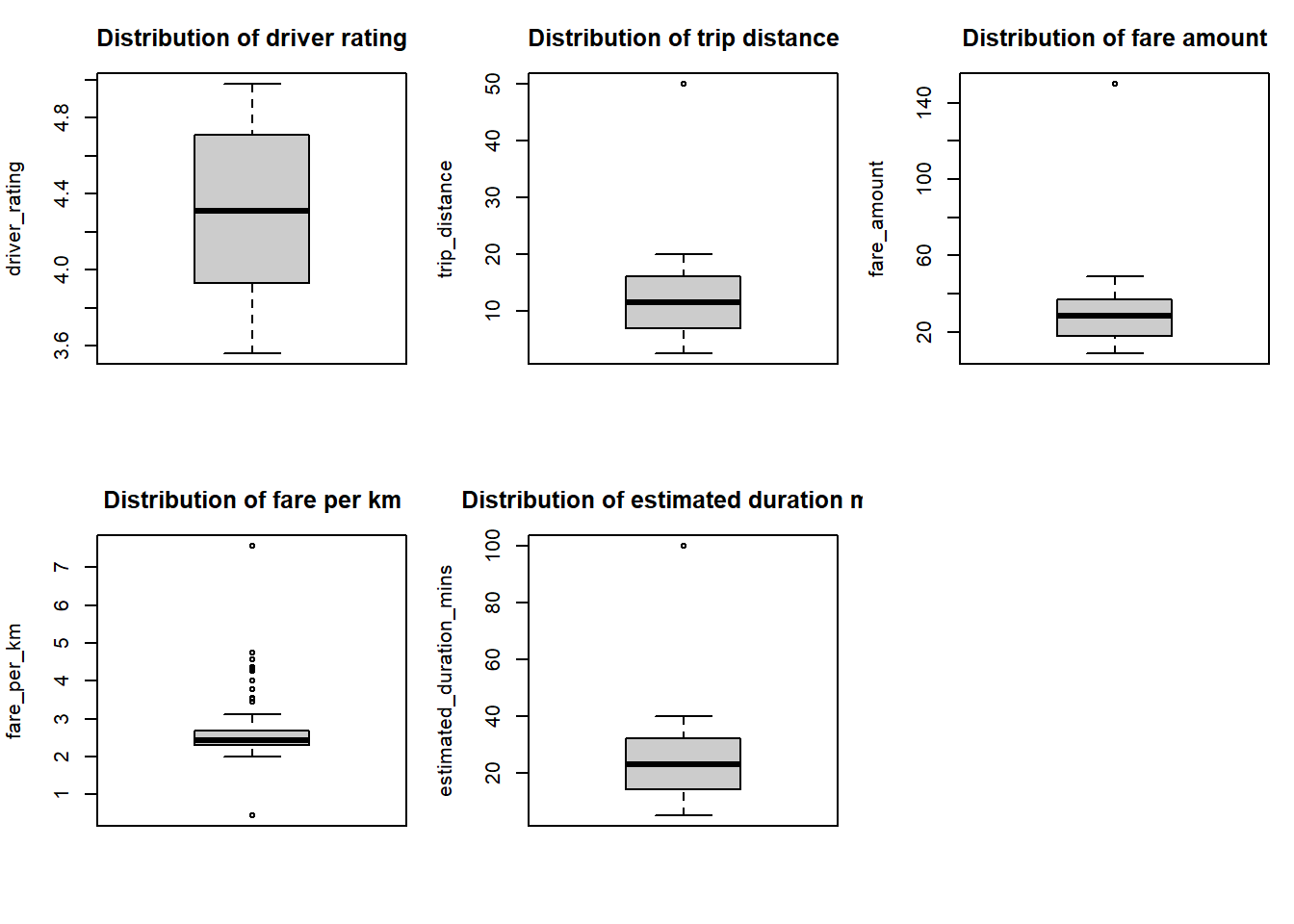
Reading the five panels:
- Driver rating runs 3.56 to 4.98 with a median near 4.31 and no low outlier. The planted 1.5 is absent.
- Trip distance clusters between 5 and 16 kilometres with the single 50-kilometre point sitting well clear.
- Fare amount clusters between $17 and $38 with the $150 point far above it.
- Fare per kilometre clusters tightly around $2.40 with a cluster of high values between $4 and $7.57, and a single low value at $0.45.
- Estimated duration mirrors distance exactly, since it is derived from it, with the 100-minute point corresponding to the long trip.
The $0.45 fare per kilometre is the artefact worth naming. The fifty-kilometre distance was written into a row whose fare was left alone at $22.72, so that row breaks the distance-to-fare relationship the generator built. Planting outliers independently across correlated columns produces this, and it is a useful thing to see happen.
Extreme values were then capped at three standard deviations from the mean.
merged_df_clean <- merged_df_clean %>%
  mutate(across(all_of(numeric_cols),
                ~ ifelse(abs(scale(.)) > 3,
                         sign(scale(.)) * 3 * sd(., na.rm = TRUE) + mean(., na.rm = TRUE),
                         .)))
Capping brought the fare maximum from $150 down to $82.77 and the distance maximum from 50 kilometres to 33.01. The IQR outlier counts barely moved afterwards, which is the honest result: capping at three standard deviations addresses the most extreme values and leaves the moderately unusual ones alone by design.
8. Transform
The fare and distance variables remain right-skewed after capping, so log transformations were applied. The +1 handles the possibility of zero values without special-casing them.
merged_df_clean <- merged_df_clean %>%
  mutate(
    log_fare        = log(fare_amount + 1),
    log_distance    = log(trip_distance + 1),
    log_fare_per_km = log(fare_per_km + 1)
)| Variable | Original range | Transformed range |
|---|---|---|
| Fare amount | $8.90 to $82.77, median $28.43 | 2.29 to 4.43, median 3.38 |
| Trip distance | 2.50 to 33.01 km, median 11.47 | 1.25 to 3.53, median 2.52 |
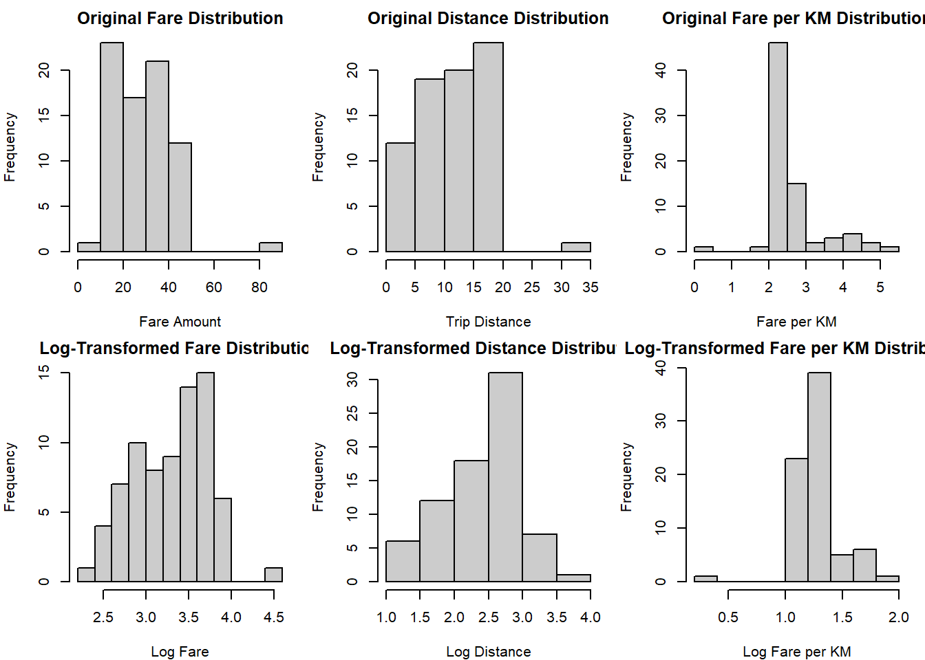
The transformed distributions are more symmetric and the long right tails are compressed. The transformation reduces the influence of extreme values without discarding them, which is the point of using it rather than trimming.
9. Summary statistics
By vehicle type
| Vehicle type | Rides | Mean fare | Mean distance | Mean rating | Revenue |
|---|---|---|---|---|---|
| Sedan | 43 | $28.70 | 12.0 km | 4.19 | $1,232 |
| SUV | 19 | $29.80 | 12.1 km | 4.29 | $566 |
| Premium | 13 | $24.90 | 9.8 km | 4.58 | $324 |
By payment method
| Payment method | Rides | Mean fare | Revenue | Share |
|---|---|---|---|---|
| Digital Wallet | 26 | $28.90 | $750 | 34.7% |
| Card | 25 | $29.10 | $727 | 33.3% |
| Cash | 24 | $26.90 | $646 | 32.0% |
Overall: 75 rides, 35 distinct drivers, $2,123 total revenue, $28.31 mean fare, 11.67 km mean distance, 4.28 mean rating.
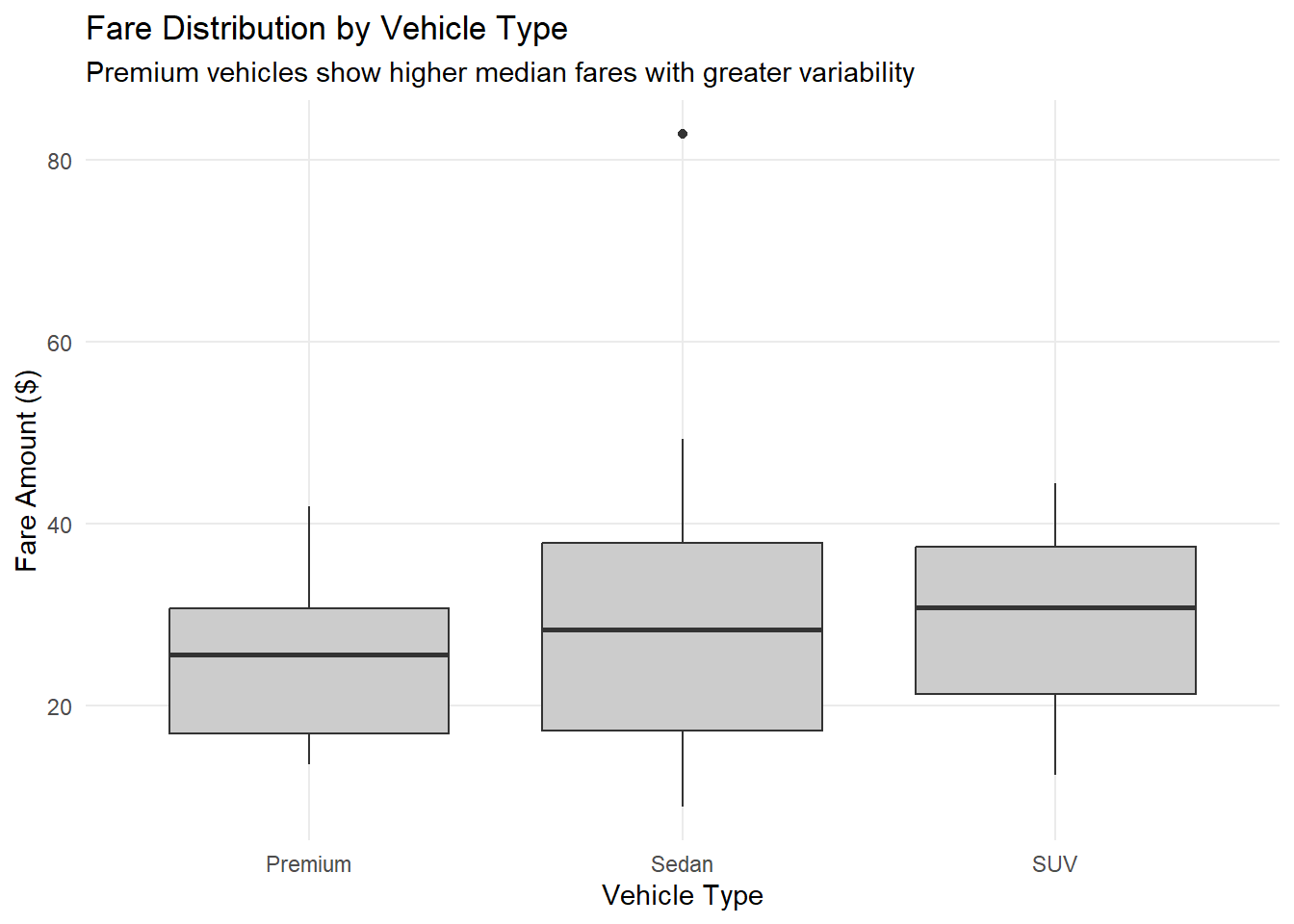
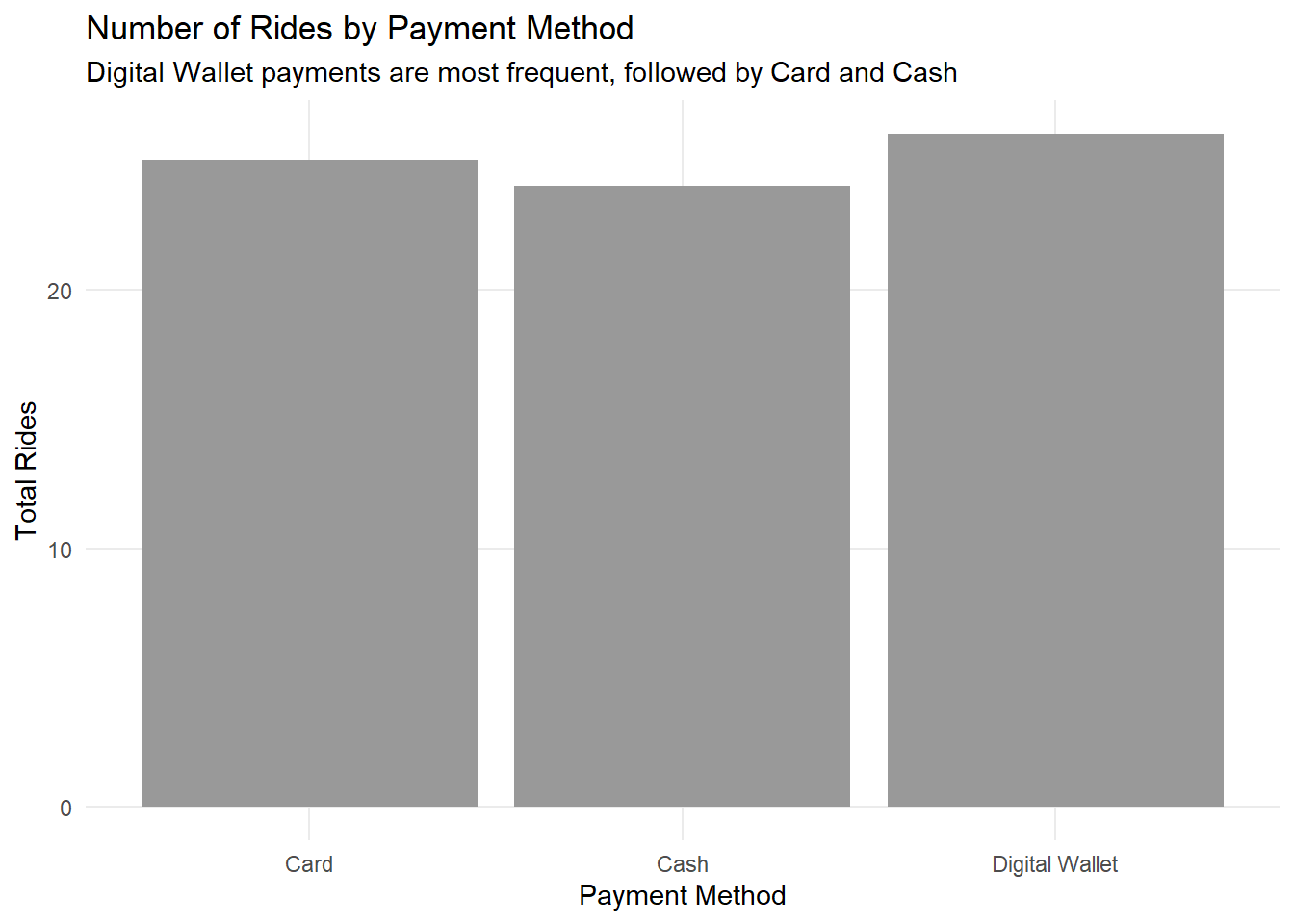
Both charts show the same thing, which is an absence of structure. The three vehicle types have overlapping fare distributions and Premium is the cheapest of the three on average, because vehicle type was assigned independently of distance and no price multiplier was applied. The three payment methods split 26, 25 and 24, which is what sampling uniformly from three options across seventy-five rows produces.
Reading either chart as a business insight would be a mistake. They are useful as evidence that the generator did what it was told and nothing more, and as a reminder that a plausible-looking chart drawn from synthetic data will show whatever was built into the generator, including the things that were not built in.
10. What the exercise produced
The dataset and the script are the artefact, not the findings. The same seed produces the same tables, the same planted problems appear at the same rows, and the same pipeline surfaces them in the same order. That makes it a repeatable teaching input rather than a one-off demonstration.
Two things would improve it. The vehicle type should feed into the fare calculation so that the Premium tier means something, since as generated it is a label with no effect. And the outliers should be planted as a coordinated set rather than independently across columns, so that the fifty-kilometre trip carries the fare a fifty-kilometre trip would carry. Both are small changes to the generator and both would make the resulting data more defensible as a stand-in for real records.
What the current version does teach well is the arithmetic of a one-to-many join, which is where three seeded nulls became nine and one seeded outlier became none.
References
CRAN 2024, The comprehensive R archive network, viewed November 2024, https://cran.r-project.org/.
R Core Team 2024, R: a language and environment for statistical computing, R Foundation for Statistical Computing, Vienna, viewed November 2024, https://www.R-project.org/.
Wickham, H, François, R, Henry, L & Müller, K 2024, dplyr: a grammar of data manipulation, R package version 1.1.4, viewed November 2024, https://CRAN.R-project.org/package=dplyr.
Wickham, H 2016, ggplot2: elegant graphics for data analysis, Springer-Verlag, New York, viewed November 2024, https://ggplot2.tidyverse.org.
Wickham, H & Henry, L 2024, tidyr: tidy messy data, R package version 1.3.0, viewed November 2024, https://CRAN.R-project.org/package=tidyr.
Grolemund, G & Wickham, H 2011, lubridate: make dealing with dates a little easier, R package version 1.9.3, viewed November 2024, https://CRAN.R-project.org/package=lubridate.