Attrition analysis usually starts supervised: label who left, fit a model, read the coefficients. This one deliberately did not. The question was whether the workforce falls into natural groups at all, and whether any of those groups leaves at a rate the others do not. Clustering answers that without being told what to look for, which means it can find a segment nobody thought to define.
It found one. A cluster of 349 people resigning at 34.4%, against 11.4% and 8.0% in the other two.
Two problems had to be cleared first, one stacked on the other.
The first was that the data was not ready. 1,482 employee records across 22 columns, and the text fields had the usual damage: inconsistent casing, stray whitespace, a stray alphabetic character in a numeric column, and one row where two fields had been entered into each other’s columns. Cleaning that is not hard, but the order matters and getting it wrong quietly destroys information. String methods only work on object dtype, so anything converted to category too early can no longer be stripped or lowercased. Convert too late and you cannot use value_counts() to see what you actually have.
The second was that the correlations available before clustering were all weak. Against the resignation flag, the strongest single relationship in the whole dataset was average weekly hours at 0.319, then overtime at 0.246, single marital status at 0.175, and a cluster of mild negatives around tenure, income and age. Nothing there supports a story on its own. A moderate correlation across 1,470 mixed employees usually means a strong relationship inside a subgroup, diluted by everyone else. That is precisely the situation clustering is for.
The finding that came out of it is not “overtime causes attrition”. It is that overtime is a label for a population whose real problems are only visible once you look at them separately, and that within that population the variable defining the group carries no information at all.
In brief
- 1,482 raw records cleaned with a dtype-ordered pipeline: strip as object, inspect as category, convert back where string operations were still needed
- One record had Gender and BusinessUnit swapped into each other’s columns, found by noticing “Female” appearing as a business unit, and corrected rather than dropped
- Cross-field validity checks passed: no record showed time in role exceeding time with current manager
- KMeans at k=3 chosen against a smooth WCSS curve with no true elbow, with the ambiguity stated rather than hidden
- Cluster 0: 349 people, 100% overtime, 34.4% attrition, against 11.4% (n=807) and 8.0% (n=314)
- Cluster 0 earns slightly more than Cluster 1 on average ($5,372 against $4,841) at almost the same mean age, so pay does not explain the gap
- DBSCAN independently isolated a 52-person, 100%-overtime cluster resigning at 34.6%, which is the same population found by a different method
- Within-cluster work-life balance against weekly hours: -0.81, against a full-dataset resignation correlation of just 0.319 for hours
The analysis in full
This work was submitted as two Jupyter notebooks with no accompanying written report, so what follows is reconstructed from the notebooks themselves: their code, their printed outputs and their figures. Where the notebooks recorded a judgement in a comment, that judgement is reported here. Nothing has been added that the notebooks did not do.
1. The dataset
1,482 employee records across 22 columns for the cleaning stage, covering demographics (age, gender, marital status), role attributes (business unit, travel frequency, overtime), compensation (monthly income, percent salary hike), tenure (years at company, in role, since last promotion, with current manager), and self-reported measures (job satisfaction, work-life balance, education level). The target variable is Resigned, a yes/no flag.
The clustering stage used the cleaned 1,470-record version of the same dataset.
2. Cleaning in dtype order
pandas had typed Age as an object rather than an integer. The reason turned up in value_counts(): one record held the value 36a. That single character was enough to prevent numeric typing of a whole column, which is a useful demonstration of why you check dtypes before you trust a describe().
The remaining object columns each carried variant spellings of a small number of real categories:
| Column | Damage found |
|---|---|
| Resigned | No/Yes plus stray N, NO, Y, no |
| BusinessTravel | TRAVEL_RARELY, Travels_Rarely, rarely_travel alongside Travel_Rarely |
| Gender | MMale, male, M alongside Male |
| MaritalStatus | D alongside Divorced |
The sequence used was deliberate. Isolate the object columns programmatically with select_dtypes rather than by hand, so nothing is missed. Apply str.strip() while they are still objects, because that method disappears once the column becomes categorical. Convert to category to read the value counts. Apply the replacement map. Convert Age to int64 now that it can be. Convert back to object to lowercase everything, then back to category again.
Doing the lowercasing last matters, because the replacement map is case-sensitive and the mis-typed values needed to be visible as themselves before being normalised away.
3. The row with two fields swapped
BusinessUnit had a category called Female, which is not a business unit. Gender had a category called Sales, which is not a gender. Both had exactly one record.
It was the same record: EmployeeID 9465. The two values had been entered into each other’s columns at source. Fixing it required temporarily converting both columns back to object dtype, storing both values, writing each into the other’s position, and converting back to category.
The alternative would have been to drop the row, which loses a real employee for a data entry error that is unambiguous once you look at it. Finding it at all depended on reading the category listings rather than trusting a null count, because neither value was missing.
4. Numeric checks
describe() and per-column value counts across the integer columns turned up nothing implausible. The specific cross-field check run here was whether anyone had been in their role longer than they had been with their current manager, which would be impossible. Nobody had. That check is only reassuring when you actually run it.
The float columns were less clean. AverageWeeklyHoursWorked contained a value of 400, which is not a working week. The mean including it was 43.30; the mean excluding it was 43.06. The outlier was replaced with the outlier-excluded mean, so that the correction did not inherit the contamination it was correcting.
EducationLevel, JobSatisfaction, MonthlyIncome and WorkLifeBalance each carried a small number of nulls, one to three records per column, filled with the column mean. The notebook records the reservation explicitly: this is defensible for aggregate reporting and not defensible at individual record level, where the right action is to go back to the source and confirm the real value.
5. Encoding and the correlation baseline
For the clustering stage, Resigned and OverTime were mapped to 1/0, and the remaining categorical columns one-hot encoded with drop_first=True, giving 25 columns.
The overall correlation matrix is mostly structural rather than interesting. Overtime against average weekly hours sits at 0.90, which is definitional. Monthly income against total working years is 0.77, percent salary hike against performance rating is 0.77, and the tenure columns correlate with each other in the high 0.5s to 0.7s. None of that is news.
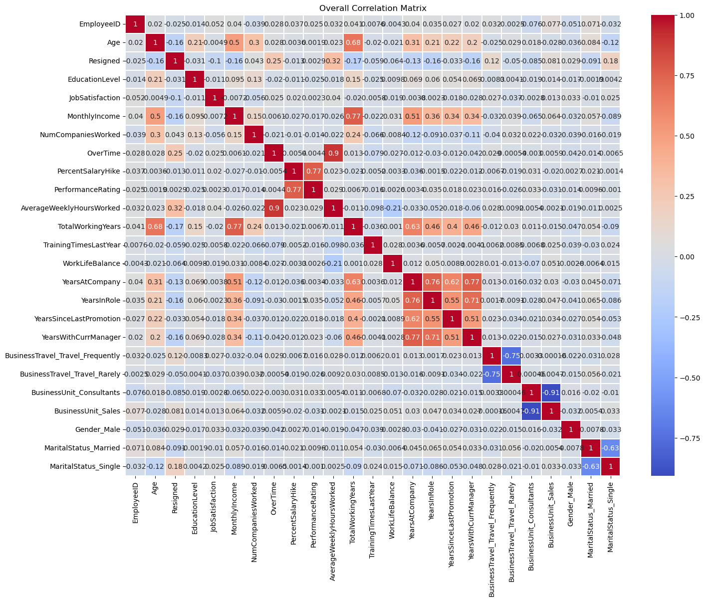
The Resigned row is the point. Its ten strongest relationships, ranked by absolute correlation:
| Feature | Correlation with resignation |
|---|---|
| Average weekly hours worked | 0.319 |
| Overtime | 0.246 |
| Marital status, single | 0.175 |
| Total working years | -0.171 |
| Years in role | -0.161 |
| Monthly income | -0.160 |
| Age | -0.159 |
| Years with current manager | -0.156 |
| Years at company | -0.134 |
| Business travel, frequent | 0.115 |
One moderate relationship and nine weak ones. Those same ten features became the clustering feature set, standardised with StandardScaler so that dollars and 1-to-4 ordinal scales could sit in the same distance calculation.
6. Choosing k
The elbow plot does not have an elbow.
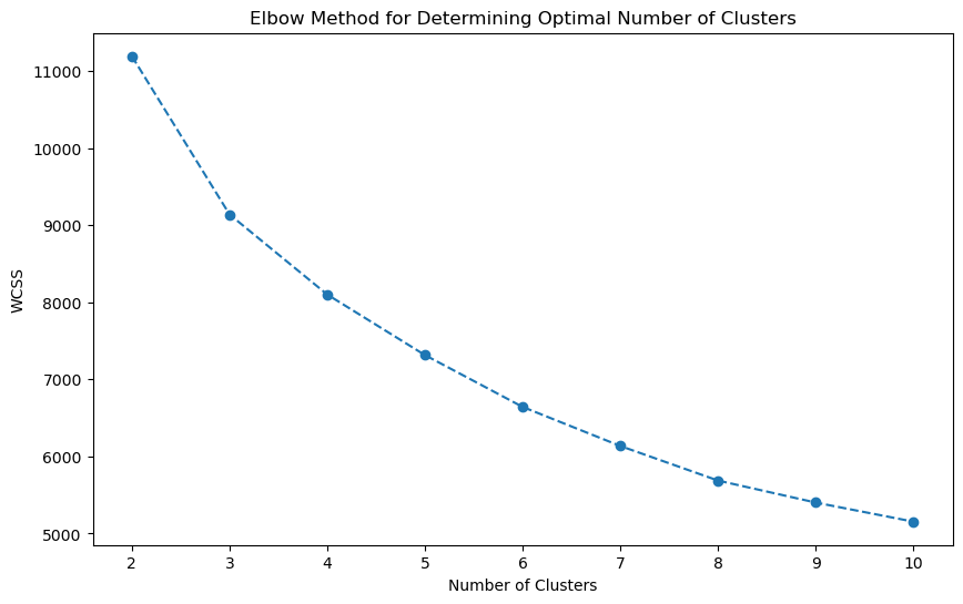
WCSS falls smoothly from k=2 to k=10 with no clean bend. That is a common and slightly awkward outcome, and it means k is a judgement call rather than a reading.
The silhouette scores give more to work with, though not much more.
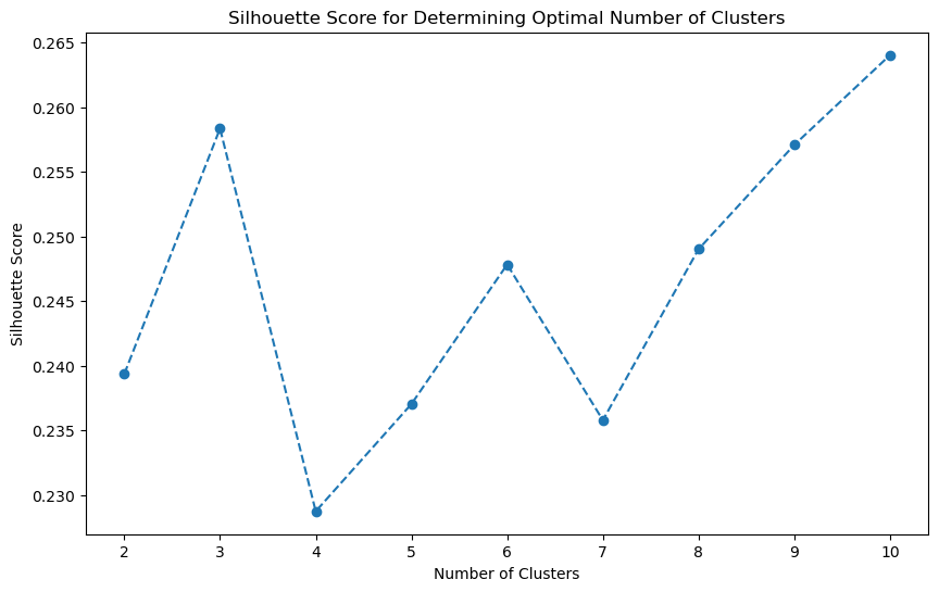
Silhouette peaks at k=3 (0.258) among the low values of k, drops sharply at k=4 (0.229), and then climbs back to 0.264 by k=10. The climb at the top end is what silhouette does when it starts rewarding fragmentation, and the absolute values across the whole range are low, in the 0.23 to 0.26 band, which says the separation is weak wherever you cut it.
I settled on k=3: the local silhouette peak, and the point past which additional clusters stopped producing groups that differed on anything interpretable. That is a defensible choice rather than a derived one, and it is reported as such.
7. The three clusters
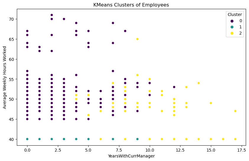
The groups split almost entirely on working hours and overtime.
| Cluster | Headcount | Overtime | Mean income | Mean age | Mean years in role | Attrition |
|---|---|---|---|---|---|---|
| 0 | 349 | 100% | $5,372 | 35.8 | 3.1 | 34.4% |
| 1 | 807 | 0% | $4,841 | 34.6 | 3.1 | 11.4% |
| 2 | 314 | 21.3% | $12,031 | 44.3 | 8.4 | 8.0% |
Clusters 0 and 1 are the pair worth staring at. Similar age, similar tenure, similar pay, and Cluster 0 is paid slightly more. The difference between them is overtime, and the attrition rate triples.
Cluster 2 is the senior group: older, more than twice the pay, nearly three times the years in role and with current manager, some overtime, and the lowest attrition of the three. That group is doing fine. Its internal resignation signal is different again, correlating weakly with being in Sales (0.167) and with years since last promotion (0.114), which is a different problem needing a different response.
8. DBSCAN as a cross-check
DBSCAN was run as a check on the KMeans structure, not as a replacement. Density-based clustering makes different assumptions to centroid-based clustering, so agreement between them is evidence that the structure is real rather than an artefact of the method.
Epsilon was selected from a k-distance plot rather than guessed, giving eps=1 with min_samples=25. The result was six clusters plus a large noise set.
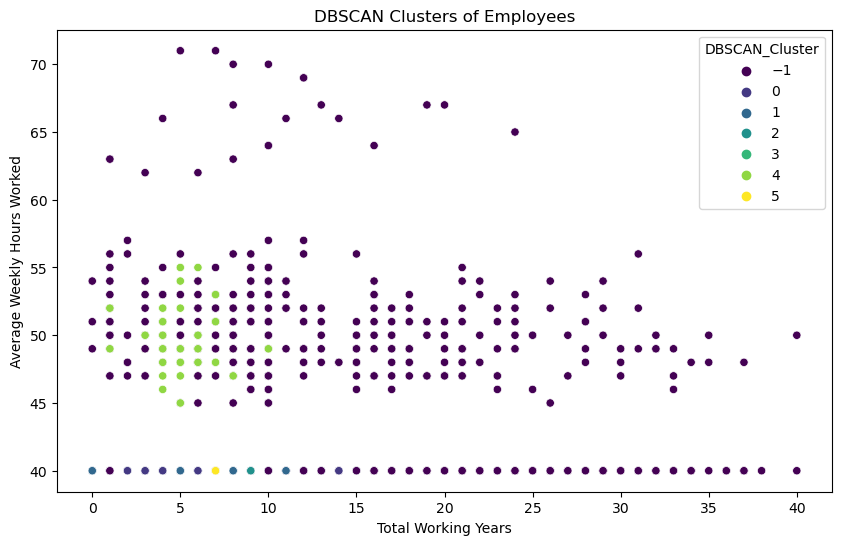
| DBSCAN cluster | Headcount | Attrition |
|---|---|---|
| 4 | 52 | 34.6% |
| 1 | 140 | 19.3% |
| -1 (noise) | 809 | 19.0% |
| 3 | 39 | 17.9% |
| 2 | 121 | 7.4% |
| 0 | 274 | 7.3% |
| 5 | 35 | 5.7% |
Cluster 4 is the result that matters. 52 people, 100% overtime, resigning at 34.6%, against KMeans Cluster 0’s 349 people, 100% overtime, resigning at 34.4%. Two methods with different assumptions found the same population and put almost exactly the same number on it.
The 809-person noise set is the honest cost of the method here. DBSCAN puts the entire high-hours spread into noise because it is genuinely sparse, which is why KMeans, forced to assign everyone, gives the more useful segmentation for this question. DBSCAN’s contribution was confirmation, not partition.
9. Inside cluster 0
Re-running the correlation analysis inside Cluster 0 changes which variables matter.
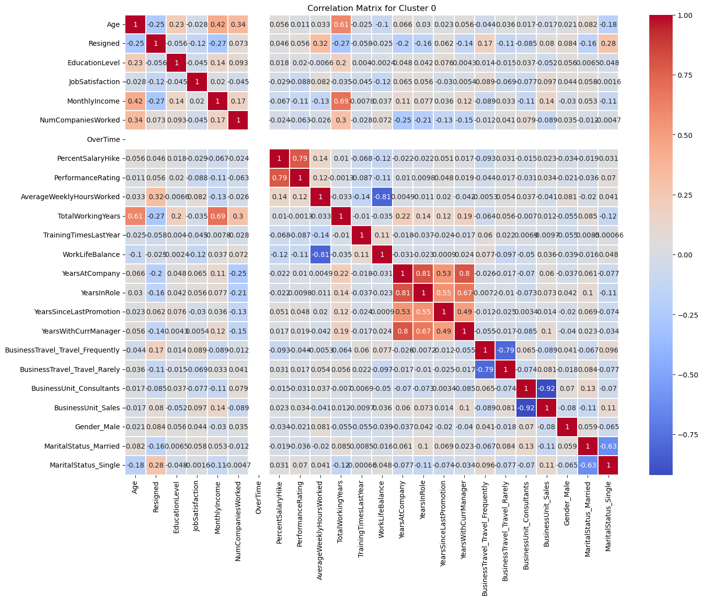
Two things happen in that matrix.
Work-life balance against average weekly hours goes to -0.81, far stronger than anything visible in the full dataset, where the same pair sits at -0.21. Inside this group, hours and the sense of a liveable life are close to the same variable.
And the OverTime row is empty. Within this cluster overtime is constant, all 349 records are 1, so it has no variance and therefore no correlation with anything. The variable that defines the group carries zero information once you are inside it.
That is the whole lesson of the project in one figure. Within this population, the resignation signal shifts to being single (0.275), having fewer total working years (-0.272), and earning less (-0.267): early-career people working overtime for below-median pay. Compare that to Cluster 1, where the same analysis produces nothing above 0.172 and no coherent story at all.
10. What it supports, and what it does not
A supervised model over the full dataset would have reported that overtime correlates with attrition at 0.25 and moved on. The segmentation says something a manager can act on: there are 349 people in a specific situation, that situation is not the same as everyone else’s, and the intervention that would help them is about hours and early-career pay rather than about overtime as an abstraction.
What the analysis does not support is a causal claim. Clustering describes structure; it does not establish direction. It is equally consistent with overtime driving resignation and with the kind of role that demands overtime also being the kind of role people leave. Separating those would need either a longitudinal design or an intervention.
Two further limits are worth stating. The silhouette scores never exceed 0.264, so the clusters are real but not sharply separated, and a different random seed or a different feature subset could shift the boundaries. And the ten clustering features were selected by correlation with the target, which means the clusters were always going to organise around the strongest of those correlations. The finding is that the resulting segment behaves very differently on the outcome, not that the segment was discovered independently of it.